
Brand Identity and Logo Design for ChildGrow360
ChildGrow360 is a non-governmental initiative focused on supporting children’s holistic development (educational, physical, and emotional).
The goal of this project was to design a visual identity that communicates care, protection, and structured growth in a way that feels approachable, trustworthy, and easy to recognize across community and partner-facing touchpoints.
Project Type
Date
Brand Identity
August 2024

Brand Challenge
Designing for a child-focused NGO requires balance.
The identity needed to:
-
Communicate safety and support without feeling fragile
-
Represent growth and guidance without complexity
-
Feel warm and human, while remaining structured and credible
The challenge was to translate these ideas into a simple, memorable mark that could scale across different environments.
Logo Concept
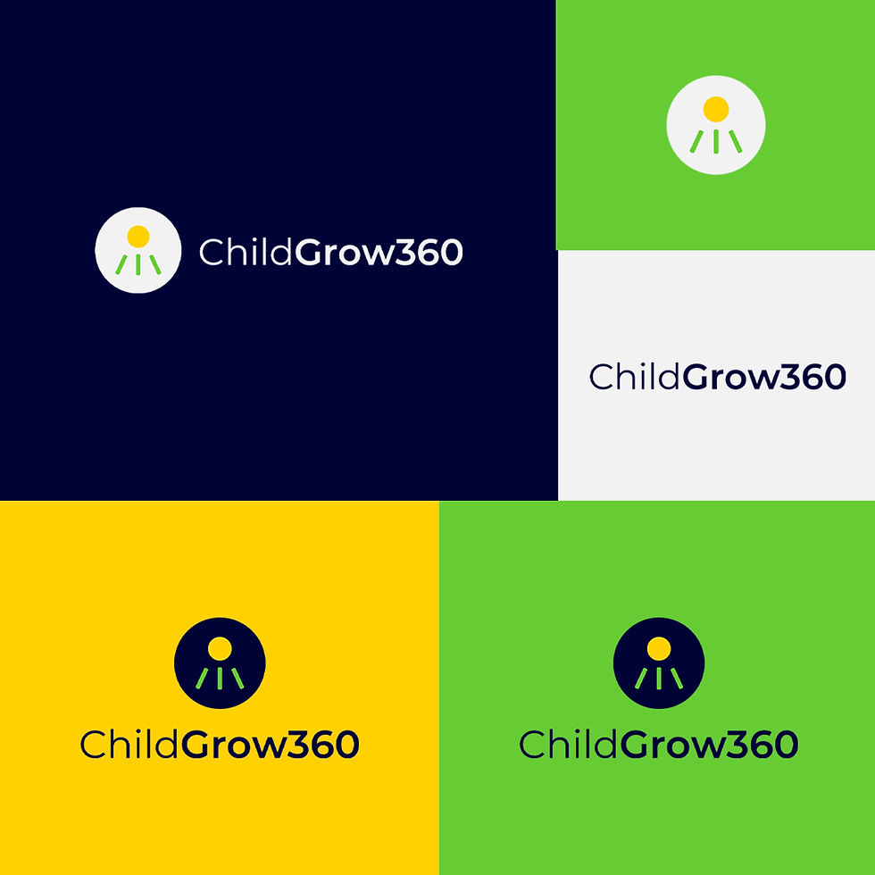
The logo concept was built around the idea of 360-degree growth (representing the full support system surrounding a child).
Key elements include:
-
A circular form representing continuity, protection, and the “360” concept
-
A central circle symbolizing the child
-
Three directional strokes representing the core areas of growth: educational, spiritual, and physical well-being
The directional nature of the strokes subtly forms a triangular motion, reinforcing the idea of upward growth and guidance.

Visual tone and pattern
The visual tone was designed to feel:
-
Soft
-
Supportive
-
Courageous
-
Hopeful
Rounded forms and balanced proportions were intentionally used to avoid harshness, ensuring the brand felt approachable and trustworthy.



© 2024. Designed by Iroh Munachimso